Every once in awhile an opportunity arises for freelancers to present their work or expertise to peers and prospective clients. Agreeing to take part is at best a fantastic chance to network, a way to exchange ideas and insights or to pick up contacts that will give you work. At worst, it is a terrifying and overwhelming commitment.
Designing a slide deck is one of the first steps to prepare for a presentation and will help guide the organization of your talk. Engaging slides will not only help you better communicate your ideas to your audience, it will demonstrate your professionalism, and knowing you've got a good deck will reinforce your confidence as you get up to speak.
Guide to Making Great Presentations (Free eBook Download)
Also, be sure to grab our free eBook: The Complete Guide to Making Great Presentations. It will help you master the presentation process, from: initial idea, through to writing, design, and delivering with impact.


Now let's get into these killer slide deck presentation design tips.
Setting up Your Slide Deck
1. Software: If you're unsure how to begin building your slides, Keynote (part of the iWork bundle) is widely considered the favorite presentation software of designers who are also seasoned presenters. PowerPoint and plain old PDFs will also do the trick.
Learn how to start using PowerPoint in this tutorial:


While software should be established upfront, it is arguably a secondary concern. The qualities that will make or break your presentation are the content and the design. Spend most of your time creating and displaying your content.
2. File format: Ask whoever is organizing your event how you should deliver your presentation.
- Will there be a computer and a projector for you to use?
- What file types are accepted?
- How big is the presentation room? This will give you an idea how large to set your text, though generally, bigger is always better.
A PDF is usually a safe bet and serves as a reliable backup to whatever format you go with. If you are running the slides yourself, go over the keyboard shortcuts and make sure you can navigate your way around the software so that your presentation will run uninterrupted.
3. Size: Generally, a 1024x768 size at 72 dpi is yet another safe bet. Most projectors do not have a resolution higher than this (those that do tend to be pricier). Images smaller than the projector's output will enlarge fuzzy and pixelated, so plan for the best case scenario, or highest size possible, keeping in mind that the larger the presentation size the larger (and heavier) your file size. The 1024x768 resolution strikes a good balance between displaying nicely and running smoothly.
4. Transitions: Go easy on the transitional animations. Simple and subtle transitions do the trick of getting from one slide to the next without distracting from your important content. Transitions on their own are not all that important to a slide deck, but implemented carefully, they can add that final, professional touch.
5. Templates: A presentation template design needs to be truly worth using. They can be poorly designed, commonly used (others will have the same deck as you), or are not versatile enough to create an interesting presentation. It is better to make your own unique template with a simple background or texture and consistent use of fonts.
Ideally, the design will speak to your subject matter. If you're not experienced at designing your own slides though, here are some professional PowerPoint templates for inspiration or purchase.

 35 Best PowerPoint Template Designs (For 2023 Presentations)


 30 Best PowerPoint Pitch Deck Templates PPT: For Business Plan Presentations

6. Give yourself credit: Make sure your name and a way to contact you are clearly labeled within your deck, typically on the first or last slides, or both.
Preparing Your Content
7. Placement: Unless you are confident that your presentation will take place in a venue with stadium seating, be sure to place text and important information at the top of the slide. This way those in the back can still get the gist of your talk without trying to dodge the heads and hairdos of tall people standing in front of them.
8. Leave room for additional insights: Do not plan to reiterate what is already apparent on the slide. Words and images should be a trigger for what you are going to say, reinforcing your speech, not making your speech redundant.
9. One idea per slide: Text and visuals on the same slide should speak to the same idea. What you are saying while that slide is on display should also support that idea, even if you plan to go further into depth.
Better yet, choose the deepest idea – the most detailed or the most complex – to display on your slide so that people will listen as you build up your narrative, helping them make sense of what they are seeing. This reinforces understanding. If you need or want to talk about a new idea, create another slide. If the idea is not worthy of a new slide then perhaps you could reconsider whether it is necessary to include it.
10. Avoid bullet points: When you are able, trade the list format for a more interesting photograph or illustration that demonstrates the same idea. If you cannot avoid them completely, limit yourself to three short bullets, which will be easier to digest than five or ten long ones.
Images
11. Bigger is better: Use large text and large images. The larger the better because they will be easier for those in the back to see. This should go without saying, but too many presentations have images with photographs too small to see from a distance. Consider swapping small images with a strong headline or a larger illustration.
12. One image per slide: Just as there should be one idea per slide, there should also only be one image per slide. This keeps the message straightforward and focused, and it ensures you will take the advice above and use extra-large images.
13. Vary your visuals: Your deck shouldn't have 100% of one type of graphic. Ideally it will mix photographs, illustrations, and text to sustain your audience's interest. The same format over and over again is boring, which is another reason not to use a standard template.
14. Creative Commons: Images with Creative Commons licenses are uploaded for free use in things like presentations, but be sure you provide proper image credit. Some licenses allow manipulation of an image, others do not. Nearly all require attribution, so be sure to provide credits when you insert the image into your slide show. Find the images you need by searching via CreativeCommons.org.
Text
15. Display less than 15 words per slide, preferably less than 10: The faster someone can read what's on your slide, the quicker they will return to your face and concentrate on what you are saying. However uncomfortable this idea may make you, it is this engagement that you need in order to captivate your audience and deliver an effective presentation.
These statistics give you an idea of how fast your audience will be able to absorb your content (as well as how fast you will be able to share it). The average person:
- speaks about 150 words per minute;
- reads about 250 to 300 words per minute;
- writes about 20 words per minute while copying.
Remember, you want your audience to be paying attention to you while they are looking at the slides. Note: Your audience will read faster than you can speak. The duration of a slide should last no longer than a couple of minutes, which is no hard and fast rule, but the idea is that you should feel confident you are not boring your audience. It only takes a split second to lose someone's interest and can take quite a few more to regain it.
16. Ensure colors are high-contrast: Most projectors do not display perfectly accurate color. Also, the rooms that you present in are rarely pitch black, even when the lights are out and curtains are drawn. This unfortunate truism means there will be less contrast onscreen, and even though they look slick, darker colors (like red on black) become difficult to read. Instead use light-colored text on a dark background or vice versa.
17. Use legible type with a good weight: Just as you should opt for colors with high contrast, you also want people to be able to read your slides from a distance. Avoid thin and ultra-thin typefaces which have a tendency to disappear into their backgrounds. Also avoid difficult-to-read display fonts, unless of course the effect is intentional.
Delivering Your Presentation
18. Walk through your slides ahead of time: Attempt a dry-run of your presentation with your slides at least twice. This will help you figure out which slides might be irrelevant, whether the ordering is appropriate, as well as how to transition from one idea to the next.
The more familiar you are with your slides and the narrative you intend to spin around them, the smoother your presentation will go. Check out the excellent tips in Learning to Love (or Survive) Speaking Events.
19. Write a script: If you are worried about losing your place while you are speaking, write a script to sit alongside your slides that will jog your memory (simply two or three bullet points per slide). You can always keep this list next to you and refer to it while you present.
20. Surprise your audience and yourself: Don't include anything in your slide deck that bores you, or it will surely bore your audience as well. Among the ways to keep your slides interesting:
- Be funny. Tell a joke or show a comical illustration.
- Talk about why you're passionate.
- Tell a personal story.
Your slides should reinforce these ideas. Try to imagine the possibilities with your deck. Look at other decks for inspiration. Be sure to attempt a creative approach toward your subject-matter, even if it means taking a risk. Doing so will make your presentation more memorable.
Follow-Up
Once your presentation is over and done with (whew), try not to fully relax until you've followed through completely.
21. Share your slides: Host your slides in a public forum for people to see and download, which will allow you to continue reaping the benefits of your presentation well after the event is over. You've invested time and effort into designing an awesome deck, so this is the least you can do for yourself.
Slideshare is one appropriate network with a huge user platform of 45 million people. The free account provides an easy embed code, as well as viewing and download stats for your files (the pay-for account provides additional user analytics).
Double check that your slides have uploaded properly, then make it widely known on your other networks (Twitter, Linked In, Facebook) that you have made these slides publicly available.
If people like your deck they'll be more inclined to download your SlideShare, give their own presentations, and spread your message, and after all there is no better networking mechanism than one that does the work for you. Learn how to use SlideShare in this tutorial:
.jpg)
.jpg)


22. Saying thanks: Others have generously expended time and energy to ensure you have a place to share your work and ideas. Gratefulness is an excellent networking technique (and generally a great life skill) that improves your community. Be sure to:
- Engage in dialogue with new contacts who reach out to you.
- Thank others who presented with you. Offer them feedback on their presentations and add them to your networks.
- Thank the organizers who invited you to present. With any luck, they'll invite you back in the future.
Do you have any additional tips for designing a great slide deck? We'd love to hear your ideas.
Extra Presentation Resources
If you're new to business presentations, we'd recommend a number of introductory tutorials to get you up to speed with the basics:
- Presentation Fundamentals Tutorial Series - This 16 part learning guide will help you get started with making busines presentations.
- How to Make Great PowerPoint Presentations - This tutorial is a quick start to working with PowerPoint.
- Ultimate Guide to Microsoft PowerPoint Templates - This guide provides a number of curated articles showcasing the best PowerPoint PPT templates, arranged by style, popularity, and quality.
Learn All About Making Great Presentations (Free eBook)
Download The Complete Guide to Making Great Presentations eBook now for FREE with a subscription to the Tuts+ Business Newsletter. Get your ideas formed into a powerful presentation that will move your audience!
Discover Additional Presentation Options
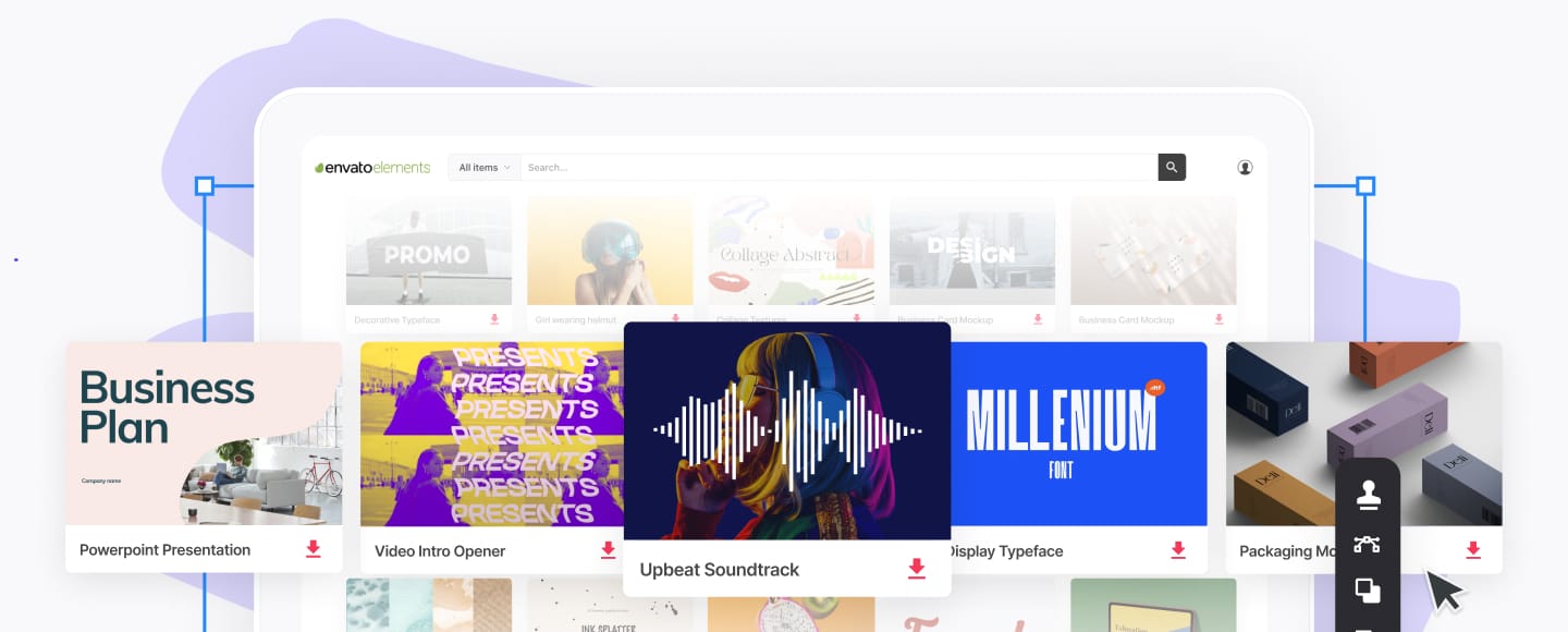
Explore our all inclusive offer on Envato Elements. Sign up for Envato Elements and you get access to thousands of graphics and templates (with unlimited use), from creative website themes, professional video files, to the best presentation templates, and more—all for one low price.
Browse through more trending PowerPoint templates or pitch deck PPT designs here on Envato Tuts+.
Editorial Note: A few times a month we revisit some of our reader’s favorite posts. This article was first published March 3rd, 2011, yet is just as relevant and full of useful information today.
Photo credit: Some rights reserved by Gettyicons.com.